Evaluating Premium Line Icons: A Practical Guide for Design and Development Teams
When assembling a visual toolkit for digital projects, the choice of icon style often determines how clean, scalable, and professional the final interface feels. Among the many options available, premium line icons have carved out a distinct niche for themselves. They offer a minimalist approach that emphasizes clarity over decoration, making them a go-to resource for teams focused on modern, uncluttered designs. But understanding what makes these icons valuable—and where they might fall short—requires a closer look at their characteristics, strengths, and tradeoffs.
Understanding What Sets Premium Line Icons Apart
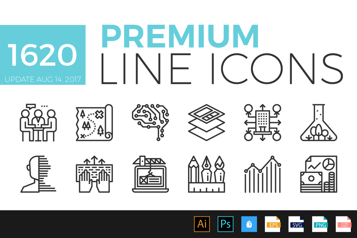
At its core, a premium line icon is defined by its use of outlines to represent concepts, actions, or objects. Unlike filled icons, which rely on solid shapes, line icons draw the eye through strokes and negative space. The “premium” label typically signals a higher standard of craftsmanship: consistent stroke widths, precise geometry, and often extended glyph sets that cover niche topics like data metrics, industrial equipment, or specialized mobile gestures. These icons are usually delivered in multiple formats—SVG, PNG, and sometimes font files—making them adaptable across web and mobile platforms. The premium aspect also often includes regular updates, customer support, and ownership rights that avoid attribution pitfalls.
What truly distinguishes these icons is their balance between abstraction and recognition. A well-crafted line icon can convey a complex idea with just a few curves, without relying on color or shading. This makes them particularly effective for interfaces where load speed and visual hierarchy matter. For example, a navigation menu using premium line icons can remain legible even when scaled down, helping users locate features quickly without visual noise.
Comparing Icon Styles: Where Line Icons Fit
Deciding between line icons and other styles—such as filled icons, multicolor glyphs, or detailed illustrations—often comes down to the project’s primary purpose. Filled icons, for instance, can offer stronger visual weight, making them ideal for calls-to-action or primary navigation in apps where immediate attention is needed. However, they can also dominate a layout if not carefully balanced. Premium line icons, by contrast, tend to recede slightly, letting content breathe while still providing functional cues. This makes them a strong choice for dashboards, settings panels, and information-heavy screens where clutter must be minimized.
Another common alternative is the use of sketched or hand-drawn line icons, which add personality but lack the uniformity that professional UI projects often require. Premium line icons maintain a mathematical consistency—identical corner radii, uniform stroke ends, and grid-aligned positions—that ensures they behave predictably across different devices and resolutions. This consistency is difficult to achieve with free or amateur collections, which may have varying stroke weights or misaligned elements that become jarring at scale.
Comparisons also arise with icon font libraries. While icon fonts have been popular for years, they can suffer from rendering disparities across operating systems and sometimes lack the accessibility features of properly coded SVG icons. Premium line icons are increasingly offered as SVG sprites or individual files, which allows developers to manipulate size, color, and animation via CSS without the blurriness or alignment issues that font icons can introduce.
Strengths of Using Premium Line Icons
One of the most compelling strengths of premium line icons is their versatility across contexts. A consistent icon set can transition from a responsive website to a mobile app prototype without appearing out of place. Because the icons are often designed with modularity in mind—matching heights, consistent padding, and harmonious curves—they can be mixed with typography and layout grids seamlessly. Designers frequently note that premium line icons reduce the time spent tweaking alignment or adjusting spacing, since the set comes pre-optimized.
Scalability is another major advantage. Line icons retain their clarity at varying sizes better than many filled alternatives, particularly at small dimensions where solid shapes can blob together. For example, in a data-heavy dashboard where icons appear next to tiny numerical values, a premium line icon stays sharp, helping users parse information without confusion. Additionally, when used in retina or high-density displays, the vector nature of these icons ensures crisp edges, while raster-based images can look pixelated.
From a branding standpoint, premium line icons project a modern, minimalist aesthetic that aligns well with current design trends. Many startups and tech firms adopt line icons to reinforce a clean, user-focused image. In client-facing work, having a polished icon set can elevate the perceived professionalism of a prototype or final product. Even in internal tools, well-designed icons contribute to a more pleasant user experience, reducing friction for team members who interact with the interface daily.
Realistic example: Consider a financial analytics platform. Using premium line icons for categories like “ revenue,” “expenses,” “forecasts,” and “budgets” allows users to scan graphs and tables rapidly. The icons act as visual anchors without overwhelming the data. If the same icons were heavily detailed or brightly colored, they might compete with chart elements or distract from numerical trends.
Limitations and When to Consider Alternatives
No icon style is universally superior, and premium line icons come with specific limitations that may affect your choice. One notable challenge is legibility at extremely small sizes, especially for complex concepts. A line icon representing a “network router” with multiple ports and antennas can become a tangled web of strokes when reduced below 16 pixels. In such cases, a simplified filled icon or a labeled glyph might be more effective. Accessibility considerations also arise: users with visual impairments may find line icons harder to distinguish compared to filled variants with higher contrast ratios.
Another tradeoff is emotional resonance. Line icons, by their nature, are somewhat neutral and abstract. For projects that aim to evoke warmth or personality—such as a children’s app, a creative portfolio, or a lifestyle brand—line icons might feel cold or overly technical. In these scenarios, incorporating hand-drawn elements, illustrated characters, or even emojis can better convey the desired tone. Similarly, for urgent notifications or error states, filled icons with bold shapes often grab attention more effectively than the subtle outlines of line icons.
Performance considerations also matter. While individual SVG line icons are lightweight, using a complete set of hundreds of icons can add to page load times if not optimized. Some premium libraries include only the icons you select, but others require loading an entire font or sprite. If your project prioritizes minimal payload size, carefully evaluate the loading strategy of any premium icon set before committing.
Budget is another factor. Free line icon sets exist, but they often lack the consistency and coverage of premium offerings. However, if your project has a very limited scope—like a simple landing page with five icons—investing in a full premium set may be unnecessary. Conversely, for large-scale applications maintained over years, the ongoing updates and support from premium providers often justify the cost.
Example: A small e-commerce site might use free line icons for category filters and navigation, but for the checkout process and security badges, premium icons with guaranteed scalability and high fidelity could instill more trust in users.
Decision Factors for Your Next Project
Choosing whether to adopt premium line icons involves weighing multiple factors. Start by assessing the visual hierarchy of your interface. If your design relies on subtle cues and minimal decoration, line icons are likely a strong fit. Consider the diversity of tasks users will perform: do they need quick scans and frequent navigation, or deep engagement with content? Line icons support scanning well.
Platform matters too. For mobile apps with small screens, line icons can prevent overcrowding, but ensure they are tested at the smallest intended size. For responsive websites, line icons adapt more gracefully to varying viewports than detailed illustrations. Also think about accessibility: pair icons with text labels or tooltips to support screen readers and low-vision users.
The quality of the specific premium set you evaluate is crucial. Look for evidence of rigorous design guidelines—uniform stroke weights, clean anchor points, and comprehensive glyph sets. Check for included formats like SVG, PDF, or sketch files, and confirm licensing terms for commercial use. Many premium providers offer sample packs or trial periods; testing a subset with your actual layout can reveal alignment issues or stylistic mismatches early.
Team skill sets also play a part. If your developers are comfortable with SVG manipulation and CSS styling, premium line icons offer flexibility. If they rely on icon fonts or pre-rendered image assets, ensure the chosen set integrates easily. Training time and documentation quality should not be overlooked, especially for larger teams.
Practical Examples in Different Contexts
A SaaS application handling project management—such as task lists, calendars, and file sharing—benefits from premium line icons because they occupy minimal space while conveying clear meanings. The same set can be used in the web app, mobile companion, and presentation materials, maintaining consistency across touchpoints. For a weather app, however, line icons might struggle to represent nuanced conditions like “partly cloudy with drizzle” effectively. Here, filled icons with gradient overlays could be more expressive.
In marketing materials, such as brochures or pitch decks, premium line icons can complement flat design styles without overpowering text. They work well as bullet point graphics or section dividers. In contrast, for an educational platform targeting young learners, the abstraction of line icons might not be intuitive; instead, colorful, detailed icons could aid comprehension and engagement.
Making an Informed Choice
Ultimately, selecting an icon style is not about finding the “best” in an absolute sense, but about matching the tool to the context. Premium line icons offer clear advantages in consistency, scalability, and modern aesthetics, making them an excellent resource for professional interfaces where clarity and performance are priorities. They are particularly well-suited for data-heavy applications, enterprise tools, and any project aiming for a minimalist, user-friendly feel. However, they are not the optimal choice for every scenario, particularly where emotional impact, high contrast, or extreme detail is needed.
To make a sound decision, invest time in evaluating your specific requirements. Test the icon set in your typical screen sizes, review accessibility guidelines, and compare the licensing model against your project’s lifecycle. By approaching the choice with a balanced perspective—acknowledging both what premium line icons excel at and where alternatives might serve better—you can build interfaces that are both functional and visually coherent, without overcommitting to any single trend.